

An Ovation for the Ballet
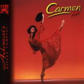
I recently designed a brochure (what we call the 'programme' when talking to the printer) for Adonais Ballet Company's production of Carmen. To do this, I used the Company's own A7000+ computer and Ovation Pro to prepare the text layout. This Brochure had 24 pages, including inside and outside covers, with 12 pages of full colour and 12 of black and white. This article is a light account of the process of putting the brochure together, describing the choices that I made along the way and a giving bit of insight into what guided them.

The Brochure format
Before touching the computer, I talked to the printer about the cost of printing different sized brochures with different numbers of pages and paper weights. One of the most important issues was having the overall size manageable for customers in the theatre. An A4 size would have been too big, A5 was too small and would have required many more pages to fit everything in. The Company finally chose a page size that was the same width as A4, but square: 210mm by 210mm. This format had artistic appeal as well, which is always handy. The printer was also able to produce it without a great waste of paper from trimming edges, and could therefore still do it for a good price.
Layout or Content first?
This is a chicken or egg question sometimes, but in this case the content was pretty much decided. After much sketching and reallocating of page space the following was decided upon:
- 2 Pages for front and back cover.
- 1 page for an advert for the Arts Educational School, Tring
- 1 page for contents
- 4 pages on Company and Ballet background
- 4 pages on the characters in the ballet
- 2 centre pages for Carmen photos
- 2 Pages for the Synopsis
- 4 pages of performers' biographies
- 2 pages of pictures from previous productions
- 1 page for the Supporters Scheme
- 1 page for acknowledgments, advert and the Shoe Fund
Typefaces and Point Size
Before implementing this layout, I had to decide upon some other basics: typeface and the base point size. It's difficult to know how much space you're going to need for some text until you actually try to do the layout, so I took the raw text and dropped it into some pages just to see how much it filled up.
Readability is especially important since these brochures would get read in theatre houselights, which are notoriously dim. After examining the array of typefaces I had at my disposal I decided upon Oxford, since its letters have relatively fat strokes giving a bolder look.
The size for the text was set at 10pt but with a 75% horizontal scaling to help get everything in. I kept the default 20% leading. Compared to the previous season's programme this was a slight improvement on readability. I set up the baseline grid to 12pt (10pt typeface size plus the 20% leading).
I chose Europe for headings, but found that at 10pt it took up more vertical space on the line than Oxford. In order to use it next to a 10pt Oxford font I had to reduce its point size to 9.2pt.
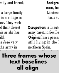
The Baseline GridOn most pages I used the multi-column format to increase readability. It shortens the line length so the reader doesn't loose their place as they scan from the end of one line to the start of the next. One of the problems of a multi-column format is that the lines of text on one column don't always line up with the lines in the adjacent column, especially if there are headings in the text of a slightly larger size. If the lines in adjacent columns don't line up it looks wrong, or slightly messy. The baseline grid is invisible in Ovation Pro (up to v2.56 anyway). When a style is locked to it, text in that style is always written along these invisible guides, ensuring that text in adjacent columns line up. There are other ways of achieving the same effect: if you are extra clever about the point size, leading and paragraph spacing of the styles you are using you can get the text to stay aligned naturally, but this only works if the different text frames are aligned at the top. |
 |
Laying it out
Most of the text was already written and formed parts of other Ovation Pro documents. To start with I collected the content for each section into a separate document and stripped each of all its Styles and Effects.
First of all, I set out the two synopsis pages. I had a certain concept in mind allowed reading of the scenes and titles without having to read the whole text.
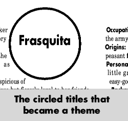
Having done that I started work on the 4 pages of Company and Ballet background. These were taken directly from the Press Release, which was already designed using oval frames around quotes and facts dotted through the text. I kept the same design idea, making all the ovals circular, and I also decided to make the text frame sides curved to follow interesting lines in the photographs next to them.
When I sat back and looked at the two sections I had laid out I realised that they were too different in approach to both go in the same brochure.
 |
Back to square oneI scrapped the synopsis layout and started over, this time using the layout concepts from the adapted press release as a starting point. This may seem like a drastic action and a waste of several hours work, but it was definitely the right thing to do. The circular frames as titles became a strong and simple theme which I used again for the characters section. |
Fitting more in
Sometimes the text just won't fit the layout, and it has a tendency to get longer as late items are squeezed in.
I've mentioned that I used a 75% horizontal scaling for the text. This is a very effective way of saving space, but it also alters the character of the typeface. Being aware of this I had decided to apply 75% to all the text in the brochure - in this way it would look consistent throughout.
Negative kerning is another space saver. This is where the gaps between each letter are reduced. I used Full Enhanced Justification for the Brochure's text and this function uses negative kerning to help fit words on a line. It also enlarges the gaps, with positive kerning, to help a few words fill a line. Because the shape of the letters are not changed this effect is less noticeable and therefore more useful for shoe-horning in the last word of a paragraph onto the end of a page.
Reducing the gap between lines, the leading, enables more lines to fit on the page. Excessive use of this can reduce readability. It also has a visual effect - the page looks darker because there is less white space between the lines, which can be offputting. This option is less useful if you're already using the baseline grid. If you want to change the leading of the whole document then you can change the separation of the baseline grid to match, otherwise you'll have to turn the lock to grid option off for the altered text.
I made extensive use of Ovation's frame shaping utilities to make the vertical sides of the frames into curves. These curves could be changed ever so slightly to enable the text to flow to a different length.
Another effect that was useful was the way picture frames repel text. Where a picture straddles two columns a small nudge can improve the flow around it creating space. This is especially true where there happens to be a number of long words next to the frame on one side.
House StyleAdonais's house style includes a whole range of idioms like date format, which is always 'Sunday 20th January 2000' and not 'Sunday January 20th 2000'. Conforming to the house style is a never-ending job. It started at the first hint of layout and was being tinkered with at the last proof reading. Other house rules are more like standards of literacy. The types of things that come under this heading are not repeating the same word in a sentence (eg: a descriptive word); ensuring that it's and its are never confused (lots of readers get instantly put off if that happens); and not being ambiguous, especially with objects and subjects of sentences (which is surprisingly easy to do). ProofreadingIt took two weeks to produce the whole programme. One week was spent putting it together, laying it out, fitting it in, padding it out and admiring the emerging document. The second week was spent taking it apart word by word (literally) to ensure that every piece was accurate and worthy of inclusion. Each turn of phrase was examined for ambiguity and readability, and I doubt that any more than a quarter of the original text was left unaltered after close inspection. Special attention was given to punctuation. The use of commas is practically a house style, and they are used almost exclusively to mimic where a pause would naturally occur if reading the text aloud. I hope I have managed to convey the scale of the task of proofreading and editing. The result is very worthwhile - 6 weeks after completion and we have yet to find a single error in the eight and a half thousand words that comprise the brochure's text. Be warned, it took several different people to spot all of the many errors that were there to begin with. A sole proof reader has a difficult job to compete with two or three people. Sending it to the printerI did not have a choice about which printer to use, so going to a RISC OS-aware printer was not an option. Deadlines in the entertainment industry are more fixed than most other situations. The premiere of Carmen was on Friday 11th February 2000, and there had to be brochures on sale at that performance at all costs. The performance was practically sold out before the brochure was even in draft format, every ticket sold being like a contract between one audience member and Adonais. Brochures at the ballet are like carrier bags at computer shows - you just can't survive without them! I had e-mailed a PostScript file to the printer in advance to see if they could handle it, but no luck there. I've no doubt that if I could have spent a week working on it (or if RiScript had been released a month earlier) I would have been able to supply the printer in electronic form, but I didn't have a week to spare. The method I used was to print all the text and simple vector graphics (frames and rules) at actual size on a 600dpi laser printer and sent that printout as camera ready artwork. All the photos and colour effects were then added by the printer. The finished result, when inspected closely, has the tell-tale feathering and less than perfectly crisp edges to the letters that this process might be expected to produce. However, the tiny degradation in quality was a cost we were prepared to pay in order to ensure that the programme was printed in time. As mentioned above, the deadline was absolute. For another type of publication a slight slip in the deadline might not matter - magazines sometimes come out late, product publicity can be delayed without serious repercussions. I know there are many readers saying 'It would have been easy to do it via PostScript', and I'm sure you're right. But that's not the point. The point is it absolutely had to be done on time, and it was. |
 |
Brian O'Carroll - Adonais Ballet Company (http://www.pebblesculpt.co.uk/adonais/)