



Insignia
Geoffrey Dean reveals his impressions of the new logo-design package from Cerilica
Insignia is the new design package from Cerilica which allows the easy creation of text-based logos for Web sites and print. The company's blurb says that "with a few clicks" it is possible to create high quality titles and banners, without the need to spend a great deal of time in a dedicated design package.
So Insignia is, by definition, a package with a restricted range of options and a limited basic purpose, and whether it's of any use to you really depends on the number of graphics-heavy titles you need to create, and whether the range of options provided by Insignia allows you to do what you want. Whilst Insignia can indeed be used to design graphics for use both in print and on the Web, its suitability leans quite heavily towards Web-based use, for three main reasons:
- The package produces screen-resolution bitmap output rather than vector graphics, and vector graphics are of course far more suitable for high-resolution printing than low-resolution sprites.
- You cannot specify the resolution of the bitmap output; a dpi setting would have made the package much more suitable for print-based work, but all of its output will be at the size you see it on the screen.
- Whilst some effects work well in monochrome, there's quite a heavy bias in the package towards the use of colourful effects which would be suitable for Web-based banners and buttons. So unless you have access to high-quality colour printing (which is not the case for most producers of newsletters and the like), Insignia is better suited for designing Web graphics.
To be fair to the package, it can export Draw files of the text in its preview window, but the range of effects that this provides is quite limited. Also, you can design your graphics at a much larger size than would be appropriate for on-screen use and thus end up with something of a suitable resolution for printing. But that's all a bit approximate and involves a certain amount of guesswork; a proper dpi setting in the software itself would have been an obvious and useful addition.
But before getting too far ahead, let's look at what the software actually does.
Fundamentally, the function of the software is very simple indeed. You type in a single line of text, pick a font to use and the text size you want, choose a range of special effects for Insignia to apply to your text, and click the Render button. A new window opens with your fancy rendered graphic and you save it out for use in your Web page or document. You can also import a sprite for use in the background of the rendered graphic (either scaled or tiled), but fundamentally that's all Insignia does.
The program has two main windows: a preview window and the output window showing the completed graphic. The preview window shows your text in black and white and has a button bar at the top. Nine buttons are provided; the first seven all relate to the different aspects of adding effects, and are as follows: Text, Shape, Colours, Background, Effect, Shadow and After Effect. The last two are the Auto Update button (the toggling of which determines whether the preview window should perform live updates as you edit various options) and the Render button which you click to create your graphic. At the left of the button bar some brief help text appears to tell you what you're pointing at.
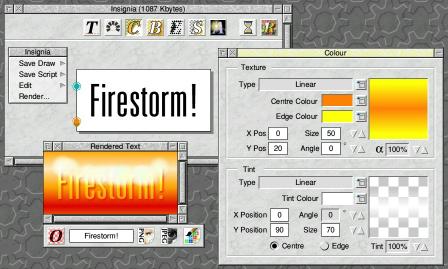 |
| Insignia in use, showing preview window, rendered text window and the colour choice window |
Each of the seven main effects buttons opens a related window in which you can edit appropriate options, and I'll run through them in turn. First, though, it's necessary to appreciate how Insignia works. It operates on four basic layers, not all of which have to be used. At the bottom is the background, which can be a solid colour, have shading, or use a sprite. On top of that is the optional shadow layer, with the text itself directly above it. And on top of the text is the optional after-effect. The background, shadow and after-effect layers each have a single button to control them; all the other tools work on the main text layer. However, it's worth noting that effects which alter the shape of the text will also affect the shadow; the two are closely tied together.
Text
The Text window is generally the first tool you'll use in Insignia. It has a single writable entry icon into which you type your text, and a choice of font from a standard pop-up menu. I was a little disappointed to find that the software does not notice if the range of available fonts changes. Users of Font Directory Pro, EasyFont and similar programs like to be able to enable new fonts at any time and have them appear immediately; but Insignia needs to be quit and reloaded before it notices any such changes.The width and height of the font used can be set independently for both the first and the last characters in the string; if they are different, the intermediate characters will be interpolated in size between the two extremes. That allows for some interesting effects, but I think it would have been useful if there had been an option to make the second pair of font sizes affect the mid-point of the string, so that the text could have scaled to the new size and back again.
The margin around the text can be set manually, which is useful for allowing more space for the shadow and other effects, which may otherwise potentially flow off the edges of the rendered graphic. You can also set the size of the canvas in pixels if you wish, which is clearly very useful for designing Web graphics to a specific size, as is necessary in Web menus and suchlike. If you decide to specify a canvas size then you can also set the justification of the text on it, which allows you to make your text line up appropriately over multiple graphics (again useful for Web work).
 |
| Text can start at one size and finish at another |
As you type the text and adjust the font point sizes, the preview window updates dynamically to show the changes. This is normally useful, but I did find that it could become slow (on a StrongARM Risc PC) with long pieces of text, and accidental entries in the font size icons could cause problems, such as having the program crash with a 'number too big' error. Luckily, toggling the Auto Update button can turn off the updates and avoid such problems.
Shape
The shape options govern the path your line of text will follow. Three options are available: Straight Line, Arc and Star. Text in a straight line can be rendered at any angle. The Star option is the least useful of the three, but does allow some quite interesting effects. Basically, a 'star' is the same line of text, rendered multiple times; once for each point of the star. In effect, you end up with a circle of lines of text, a bit like a bicycle wheel with each line representing one spoke. The number of points (lines of text) can be set, as can the radius of the 'hole' in the middle and the overall angle of the star itself. An example of one use of this effect will be shown later in this review. The Star is a nice effect, but one with only a limited number of practical applications.More interesting, flexible and generally useful is the Arc option; the Shape window looks like this when set to Arc mode:
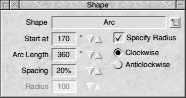 |
| The Shape window in Arc mode |
Using the Arc option allows your text to be printed in a curved shape; it can be anything from a shallow curve to a whole circle, and you can set the starting angle for the text as well as the length of the arc. The letter spacing can be adjusted, the letters can go inside or outside the invisible bounds of the arc, and the radius of the arc can either be calculated automatically or set manually. The option is therefore about as flexible as it could be.
To test the circle-writing facility, I used the settings shown in the screenshot above to produce the following graphic (the RISC OS cogwheel in the centre was an imported sprite background):
 |
| A good candidate for an animated logo |
This graphic seemed to lend itself ideally to an animation in which the shape in the centre could remain static but the text surrounding it could rotate. I therefore plotted this graphic 36 times, changing the starting angle of the text by 10° each time, and produced an animated GIF of the resulting frames in the hopes of ending up with a useful logo.
Unfortunately the results were not good. Despite the fact that I had used all-capitals, the text was justified slightly differently between the frames, with the result that the circle of words jiggled around unpleasantly as the animation played. Clearly the justification was happening according to the shapes of the plotted letters rather than the circle around which they were being plotted. Now this isn't really a fair criticism of Insignia as such; it wasn't designed to produce animations in this way. But nevertheless, an option to keep the precise position of the conceptual circle (or arc) in the window fixed, rather than relating the output to the actual plotted text, would be a useful addition as it would allow the easy creation of the kind of effect that I was trying to produce.
A useful byproduct of the Shape window is the ability to produce Draw files of the letters in the preview window. As you set the various shape options (lines, arcs or stars), the preview updates to match, and you can export the resulting images as Draw files. So if you do want to produce circular text in vector format, you can.
Of course, for complex arcs and stars, update of the preview window can become quite slow, but you can at least turn off the Auto Update option.
The only surprising drawback of the Arc and Star options is that they do not permit the use of the interpolated text sizes mentioned above; these facilities only work with text in a straight line. The absence of this facility when used with these shapes seems rather inexplicable. Whilst the maths could conceivably get a bit complex with the Arc option, the effect is certainly not impossible to achieve; and as the Star option is no more than multiple copies of the text printed in straight lines at various angles, I can see no excuse for the absence of the text-sizes effect. Indeed, for the star shape, it would have been particularly useful if the text could be made to flare out in size as it extends from the centre to the edge of the star. The inability to apply this effect in these circumstances is an omission which seems both serious and arbitrary.
Colours
The colour of the text can be set to be flat or graded, or text can be filled with a sprite (tiled or scaled). The colours in Insignia all work to the full 24-bit palette, and the RISC OS colour picker window is used for choosing colours. There's not much to say about the use of flat colours except that, of course, one single colour must be used for the entire line of text; you can't set individual colours for the separate letters. You can, however, set the 'alpha level' of the text; 100% is solid, but anything less allows the background to show through.Colours can be graded in the text in a number of ways, though. You set a pair of colours and then choose a fill style to blend between them. You can have a radial fill (you can set the radius), a linear fill from edge to centre and back again (you can set the size of the band and its angle), or a rectangular fill that goes around the edge of the canvas (you can set its width).
These options are all fine, but I was disappointed in the case of the radial fill that the fill has to be circular. This seems unreasonably restrictive; after all, lines of text are, by definition, rectangular! A single letter may have a roughly circular bounding box, but in the vast majority of cases, an elliptical fill would be far more useful, and could easily have been implemented if a pair of radii could have been specified rather than just a single radius. Another annoying shortcoming.
In combination with the above colour/texture options, you are also able to set a 'tint'. This can be thought of a colour-adjustment highlight which can be applied on top of the basic colour options. Its level can be set as a percentage, with 0% meaning that it's absent and 100% meaning that it swamps (and replaces) the underlying colour. The tint can be flat or can (more usefully) be a linear, rectangular or radial gradation. You can set the tint colour independently of the underlying text colour, and the option is very useful either for adding a highlight, or for adding a third 'colour' to the pair you've defined in your basic colour gradient.
Background
The operation of the background colour choice window is absolutely identical to the text colour window just described, with the single exception that there's no 'alpha' setting, because obviously the options deal with the page background itself.You can still have the background as a flat colour, a gradation between two colours or a scaled or tiled sprite, though, and a Tint option is available for the background just as it is for the text. So you might, for example, have linear gradations going horizontally in the background and vertically in the text, with different tint highlights in each, or letters in one tile appearing on top of another tile, for example.
The colouring options provided by Insignia are actually very flexible. The absence of an elliptical radial fill is disappointing, but aside from that omission the options are powerful and work well.
A few simple examples of colours and tiles follow.
 |
| The word "RISC OS" uses the RISC OS 4 menu tile to fill its letters, on a background of the Pinboard cogwheel tile which was recently introduced with the Select scheme; the background has been moved so that the "O" is centred on a cogwheel logo (this graphic can itself be tiled) |
 |
| The intention here is to give the impression of shiny letters reflecting blue sky and grass: a green-to-blue linear gradation has been used with a white tint at the centre where the colour transition occurs; the background is an orange-to-pink radial blend with a white horizontal tint |
 |
| In a similar way to Reflections, above, this example intends to simulate reflective letters, but less shiny ones this time; linear gradations and pale-coloured highlights have been used to give the impression of metallic lettering that has been raised from its background |
The only other disappointment with regard to colours is that the preview window gives no indication of the colours that you've chosen; the lettering here always appears in black on white. If you want to export the letters as a Draw file, therefore, you have to add the colours you want afterwards in Draw, and more importantly there's no visual feedback about the colours you have chosen. It's therefore easy to forget, sometimes, that you haven't edited your colours, and render the letters in Insignia only to find that they're not in the colours you intended. This is a trivial point, and clearly it wouldn't be reasonable to try to emulate graded fills and so on in the preview window. Nevertheless, I don't see why simple foreground and background colours (and perhaps background sprites) couldn't have been represented in the preview.
Effect
The Effects section of the program is where various 'calculation-type' effects can be applied to the letters (and their shadows, if present). Effects available are Blur, Halftone, Ripple, Vortex and Pixelise. These are of slightly variable usefulness, but some are quite powerful.The simplest effect is Pixelise, which effectively reduces the resolution of the rendered letters so that they appear very blocky. If you look at anti-aliased font manager text through a magnifying glass, the effect is similar. The effect allows you to set the width and height of the pixels independently.
Blur is also quite simple, and merely blurs all the edges of the letters; a common operation in most image-manipulation software. Again, the amount of blurring (in pixels) can be set. It's a useful effect but not very exciting.
The three remaining options are more interesting. Halftone simulates the variable-sized dots of ink used to represent shades of grey in monochrome printing, as seen in laser printer output and photos in a newspaper. The size and spacing of the blobs can be set to produce a wide range of effects (and this is made even more interesting if a shadow is also included). Whether this is considered a useful option will largely depend on the designer's inclinations, but the possible effects can certainly be eye-catching.
| (Click this image to see the effect at the proper size) |
The Ripple effect adds a wavy edge to the letters, as if they have been cut out with a pair of pinking scissors. The frequency and amplitude of the ripples can be set, and you can also determine whether the ripples should occur in a vertical and/or horizontal direction. The effect is quite impressive, and suitable for watery letters, crinkly-paper letters or other such distorted renditions.
 |
| The Ripple effect has been used here to give the letters their jumpy edges; also, the Shape>Arc tool was used to write the letters in a curve, various subtle blending options were used to colour the image, and an after-effect was used to create the 'bubbles' |
Finally, Vortex allows you to apply a 'sucking plughole' effect to your lettering; it's hard to describe, and the effect will have markedly different results on your graphic depending on where you place its centre, but it certainly allows for some interesting possibilities (which, again, you may or may not find frequently useful). The size of the vortex and amount of rotation applied to it can both be set.
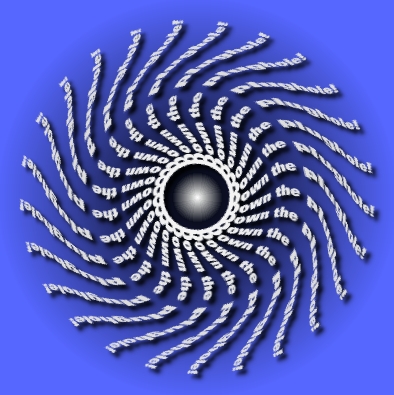 |
| Here, the Shape>Star option was used to create the basic lettering, and then a vortex was applied to the precise centre to create the swirling effect; radial colour blends were used to colour the image, and a background highlight tint was placed as a small white radial highlight at the vanishing-point in the centre |
The various effects certainly provide lots of interesting possibilities. The only really frustrating thing is that you can only apply one at once; it would have been better if each had its own on/off button so that you could apply several of them to the same image simultaneously.
Shadow
Despite its apparent simplicity, I personally think that the Shadow function is the single most useful feature in Insignia. The reason it's so important is that it creates 'soft shadows', and they're really quite hard to do without a dedicated function in an image-processing package.How often have you wanted to put a drop-shadow behind an object and had to put a simple, crude solid shape there because your software didn't provide a more sophisticated shadow function? "All too often," is your probable reply. A true shadow should start out dark and fade away to its edges, and should also allow the underlying background colours to show through, in an appropriately darkened form.
Genuine soft shadows instantly give your graphics a vastly more professional appearance, and Insignia produces very nice ones for almost no effort from the user. They're optional (you're not obliged to have a shadow at all if you don't want one) and you can tinker with various parameters. The amount of blur can be set for the shadow (this determines its softness), and setting it to 0 gives a hard-edged shadow which exactly matches the outline of the text. The opacity and colour of the shadow can be set freely, and you can also modify its horizontal and vertical offsets. Finally, you can alter its horizontal shear and the amount by which it is stretched or shrunk vertically, thus allowing the production of 'floor shadows' rather than 'wall shadows'.
The shadows obey the effects you've set for the letters (i.e. they follow the letter sizes, go into arcs and stars, and get the same ripples, vortex effects and suchlike), and the effects are extremely good. It's also worth being aware of the fact that innovative use of shadows (bearing in mind that you can set them to appear directly under the letters, rather than being offset from them) can produce some very interesting effects. A few examples follow.
 |
| This is a very simple graphic: plain orange letters on a tiled background with a standard dark grey drop-shadow; but if you look closely at the shadow, you'll see that it darkens the background beneath it (look for the orange speckles) and looks very professional |
 |
| Another simple effect: this time the horizontal shear and vertical stretch of the shadow has been adjusted to give a 'floor shadow' rather than 'wall shadow' effect |
 |
| Impressive images can be created using no colour at all! Here the letters are pure white on a similarly white background, so you can't actually see them, but the shadow defines their edges sufficiently to create a legible, professional-looking effect |
 |
| As with the previous example, here the letters are not actually visible, being black on a black background; the eerie green outline has been created by placing the shadows directly behind the letters, stretching them vertically and shearing them slightly, and increasing the amount of blur |
So, as should be clear from the examples, there's plenty you can do with an apparently simple effect. The only thing I would say about the shadows is that it's a pity that you can't stretch them horizontally as well as vertically (and perhaps shear them vertically as well as horizontally). At present you can stretch vertically and shear horizontally, but not vice versa. Although such reverse operations may rarely be useful, they would allow for a wider range of possibilities, and a horizontal-stretching operation would have allowed the 'Night Terrors' example, above, to have been more effective.
After Effect
The final section to discuss is the after-effects that Insignia provides. As the name suggests, these are the last to be applied to the image, and application takes place after the other calculations have been done. Insignia provides just three after-effects (and two of them are very similar): Spangles, Snowfall and Lens Flare. All appear in quite a complex-looking dialogue box: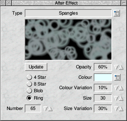 |
| The After Effects window in Spangles mode |
The Spangles effect overlays the picture with a selection of stars (with four or eight 'arms'), blobs or rings to give a glittery or bubbly effect to the picture. It was used to create the watery rings in the earlier 'Glug glug!' example (with the settings shown in the screenshot above). The number of spangles can be set, as can their opacity, size and colour. Variation settings can be adjusted for both size and colour to determine by how much (if at all) the size and hue of the spangles should alter.
 |
| This version of the previous 'Chrome highlight' example has had pink 8-star spangles added to it to liven it up and make it look more glittery |
The Snowfall after-effect is actually all but identical to the Spangles effect, and bears no real resemblance to snow at all. The reason for its name is that the spangles are applied to the tops of the letters in the rendered image; i.e. they fall from the top of the image rather than being distributed all over it. In other respects the two effects are the same.
In fact, the Snowfall effect is better at producing a fire effect, by lighting letters like candles on a birthday cake, than simulating snow, as the following example illustrates.
 |
| Snowfall has been used to drop pale yellow blobs, with subtle colour variations, on top of the tall candle-like letters; the letters and background have been coloured in linear red, orange and yellow shades, and white highlight tints placed at the level of the 'flames' to provide additional intensity to the brightness of the fire |
The after-effects are always plotted entirely at random. This may or may not be considered a good thing. Certainly it adds interest and variety to the output, but if you find an effect you like, and want to reapply it to the image with new lettering, for example, you can't. It would have been good to have a 'random seed' setting in the window, which could optionally have been specified to allow exactly the same effect to be reproduced at a later date.
The variations in rendition do at least allow for some potentially fun animations. I tried re-rendering the 'Firestorm!' example several times and combining the resultant output into an animated GIF (using the freeware InterGif application) to produce an image with flickering flames. The result seemed quite pleasing.
 |
| Eight different renditions of the previous 'Firestorm!' example, compiled into an animated GIF image |
The remaining after-effect is lens-flare. With this effect you can set the start and end positions of the flare effect, its opacity, colour and colour variation. The effects can be quite striking.
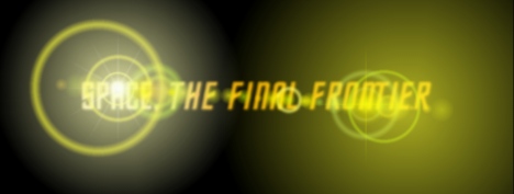 |
| A strong lens flare effect in use with slightly blurred lettering (click the image to see the full-size version) |
As with the other effects discussed previously, you are only allowed one after-effect per image, and this seems a shame; I would have liked independent on/off switches for each effect, so that two could be applied at once. The lens flare example shown above, for instance, might have benefited from a starry background created by the Spangles after-effect. The range of after-effects provided is also a little disappointingly small.
Output
Once you've generated your image, it's ready to save and you have only a couple of other things to consider: the file format to use and the question of opacity.Insignia offers sprite, JPEG and PNG file output. Unfortunately the widely-used GIF format is not provided because of legal problems surrounding the format, but you can always output as a 16 million colour sprite and use InterGif to produce a nicely optimised GIF image if you wish. Sprites are great for RISC OS users but aren't supported by Web browsers on other platforms; JPEGs have their related quality-loss issues which may or may not be important depending on the graphic you've created; and PNG is a very useful format which, unfortunately, has not yet achieved the level of support enjoyed by GIF files.
JPEG images do not support transparency, whereas both sprites and PNG files support up to 256 levels of transparency, though the number of programs able to display such files correctly is very limited. Acorn's Browse Web browser is one of the very few browsers on any platform to be able to cope with full PNG transparency. Similarly, whilst most RISC OS applications can handle 'normal' masked sprite with simple on/off masks, only a few (Photodesk, Vantage and a few others) can handle sprites with 256 levels of transparency.
The question of transparency is important because of the last feature of Insignia which has not yet been described. Transparency can be applied to the final image as saved out from the program. Note that there is no way of previewing this in Insignia itself; you will only see the opacity effects by examining the resultant graphic (assuming you haven't saved as a JPEG, the format which doesn't support the feature).
The opacity can be set to be off, plain (i.e. making the whole image translucent), or one of the standard set of gradation patterns from the colour options described earlier: linear, rectangular or radial. Again, the absence of an elliptical shape is a disappointment. The presence of this opacity effects window is potentially a good idea, but the practical limitations of current file formats render its usefulness limited (particularly for the Web).
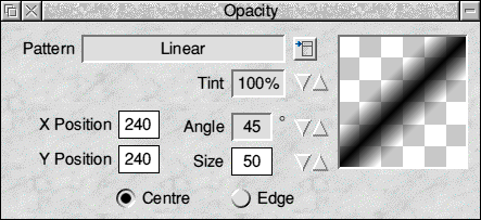 |
| The Opacity window in Linear mode |
As a final point, it should be mentioned that it's possible to save a 'Script' file out of Insignia: this is a simple human-readable text file which defines all the settings currently in use in the program. You can drag one of these files back into Insignia at any time to reload the settings for the creation of a particular logo. You just need to be aware that any after-effects you replot will come out differently each time, so it's not possible to reproduce a graphic exactly if it uses these effects.
Insignia's interface and performance
Overall I found that Insignia was presented logically, was easy to use and worked well. Cerilica's claim that it can produce impressive results with just a few mouse clicks is not too far from the truth, though in reality you're likely to have to render a graphic a few times before you get exactly the effect you want.The trouble is that the interface, whilst basically quite good, has a number of annoying shortcomings, and the speed at which the program works can also be disappointing with more complex effects.
First of all, there's a certain degree of inconsistency in the interface. Some numeric fields allow you to type the numbers at the keyboard and also have bump arrows for quick adjustments; others have writable fields but no bump arrows; yet more have bump arrows but don't allow you to type into them. Why so much inconsistency? I can see little justification for this. In fields which won't accept the caret, it's possible to make larger adjustments to the numbers by holding down <Shift> or <Ctrl> while clicking, which is a useful shortcut, but I don't see why a more universally helpful and consistent approach couldn't have been taken for the numeric value icons.
Similar inconsistencies exist in the graphical previews provided in various dialogue windows. The preview in the Shadow window will either update 'live' or, if you turn off the Auto Update option, only when you click the Update button. But other windows always give a live update, or only update when you click an Update button. The Effects window, in fact, contains a mixture of these styles! The justification is that some effects take longer to process than others, which is fair enough, but different machines will vary a great deal in processor speed, and I don't see why a universally consistent approach couldn't have been adopted, using the most flexible Shadow window as the model.
Then we get to the matter of the preview window. To my mind, this really isn't a preview window at all, because the graphic it shows does very little by way of previewing the final result! Usually it displays a simple line of text. If you have chosen Arc or Star effects from the Shape window then yes, those are indeed previewed, but beyond that you don't see any of the other effects until you render the final image. I've mentioned above the annoying absence of even a simple colour preview in this window, and whilst certain effect certainly could not sensibly be previewed, I'm sure that others could. For instance, the Ripple and Vortex effects could be given vector previews, and this would have the side-effect of making the Draw output more useful. If processor speed is a problem, then surely there could be additional 'preview this effect' buttons which could be turned on and off independently for each section of the program.
Next we come to the idea of 'markers'. Although I haven't mentioned these before, they're quite widely used by the program. Many effects require a point (or, in the case of the lens flare effect, two points) to be defined to determine where on the canvas the effect takes place. For instance, you can set the origin of a tiled background sprite, the centre of a radial text fill, the centre of distortion of a vortex effect and so on. For the lens flare, you need start and end coordinates. In all such cases, you can either type the x and y coordinates into the dialogue box or drag a marker in the preview window with the mouse.
This is fine as far as it goes, and I'm not criticising the basic idea. The problem is that, aside from variations in colour, these markers all look exactly the same. Pointing at them causes the help icon in the button bar to tell you what they are, but it's a very crude interface. The markers all use completely arbitrary colours and otherwise look identical.
I would have considered it far better for each type of marker to have its own distinct shape (i.e. be designed as a monochrome icon) to show visually what it represents, and the marker should also be coloured appropriately for the effect to which it relates. In other words, if the user has set an orange-coloured fill, the marker could use the same shade of orange. It also seemed particularly difficult to judge exactly where the ends of the lens flare were going to appear by dragging the markers (see the 'Space' example, earlier; I wanted the 'star' effect to show through the hole at the top of the 'A' in 'SPACE', and it took a lot of experimentation to get it right). It would be far better if the draggable markers for the lens flare could actually show a quick preview of the size and position of the dominant circular effect at each end of the flare, as drawn circles (probably with a line between them to show the angle of the flare).
These criticisms are somewhat frustrating because in other respects the interface works very nicely. For instance, the previews of colours and sprite tiles in the foreground and background colour windows update as you edit values, and show a good indication of opacity and so on. They're very well done, and it's a shame that other aspects of the program aren't as well thought out and helpful to the user.
The program is also far from bug-free. Whilst none of the bugs I encountered was really drastic, there were some silly and annoying ones. For instance, after importing a script, I would often find that the colours windows (text and background) would be displaying a scrambled set of options, such as 'plain colour' with linear graduation options available. Sometimes the pop-up menus or preview panes in dialogue boxes would inexplicably stop working. If more than one program needed to use the RISC OS colour picker window (e.g. Insignia and Paint running together), there could be a lock-up on the desktop which required a press of <Alt-Break> to kill off one application. And the typing of silly values (even by accident) in writable icons could cause the program to quit with a 'number too big' error. These problems are all quite trivial but add up to give the impression of a program that needs a little more polishing.
(I have spoken to Cerilica and a new version of Insignia is due "in the next couple of months", this should address these problems - ED)
A final annoyance was with the size of the canvas. After applying effects I sometimes found that I wanted to alter the width of the margin around the text to show more effect, or less empty space, according to the results I got. And yet if altered this value, the offset values used by various effects would then become incorrect; my floor shadow would move; my carefully-placed background tile would become misaligned; my lens flare would be plotted in the wrong place; and so on. It's not the end of the world, but it's annoying.
Packaging and presentation
A quick word about packaging: Insignia comes on two floppy discs in a CD-style jewel case. Aside from the program itself, a set of examples is provided along with a 50-page manual in PDF format.The examples are very impressive; they really show a good range of things that the program can do, and provide genuine inspiration for its potential uses.
I was less impressed by the PDF manual, though. Whilst there's nothing wrong with it as such (it's logically laid out and tells you what you need to know), it didn't seem terribly well written, and I found its constant use of incorrect terminology most annoying. On page after page, for instance, the manual insisted on referring to pop-up menus as 'pull-down menus'. A trivial point, maybe, but the distinction between the two is very clear. A pull-down menu is a menu whose top-level items are permanently visible in a horizontal strip, and from which the submenus pull down from top to bottom. Windows PCs and Apple Macs have pull-down menus; RISC OS machines don't use them. RISC OS has only pop-up menus, and they're much superior. Insignia's manual consistently gets this and other standard terminology wrong, and I just wished that whoever wrote it had taken the trouble to get such details right. Such things are important, particularly given that Insignia is more likely to be used by new or inexperienced users than by old hands who are familiar with RISC OS concepts.
Final thoughts
So my reactions to Insignia are frankly mixed. In some respects I like it very much: it has some genuinely impressive features, it does indeed do what Cerilica claims of it, and in fact I found it great fun to play with; it grew on me as I used it. It's also quite reasonably priced for what it does, assuming you do have a genuine use for it.But aside from the clutch of minor but irritating bugs, I had a few reservations about it. For a start, it's really quite slow. In fact, given the fact that it's written almost entirely in Basic, it's surprising that it performs as well as it does, but the speed issues do mean that you're at a serious disadvantage if you don't have a StrongARM-based machine. Also, given the very limited usefulness of the so-called Preview window, you'll often have to have multiple attempts at rendering an image before you get it exactly as you want it; and if each rendering process takes, say, a minute (as can happen with complex effects), you can end up wasting quite a lot of time.
More importantly, from my point of view, is a feeling of disappointment in terms of what the program can't do. I would dearly have liked Insignia to have a 'Draw file layer' in addition to what it has already. It's very often desirable to base a Web graphic (or any other logo for that matter) on a vector drawing rather than a piece of text; or indeed a combination of the two. Who wouldn't, for example, like to be able to draw a simple logo in Draw and then use Insignia to add a nice soft shadow to it? Given the usefulness of Insignia's shadow function for text, the ability to add similar shadows to drawn objects would be extremely valuable, and a very good reason for wanting to buy the software.
In a more ambitious vein, it could be desirable to apply many of Insignia's other effects (e.g. the Star and Ripple options) to Draw files, even if certain restrictions were imposed (such as the ability to work only on path objects). But no; sadly there is no provision at all for being able to import Draw files. I hope that this improvement may at least be considered for a future upgrade.
Finally, of course, the range of effects provided is a little limited. What's there is good and works well, but it would be nice if more effects could be added as plug-ins. However, this may well not be technically possible.
In conclusion, then, I'd certainly recommend Insignia. Despite my various criticisms, the package is easy and fun to use, and can produce excellent results. I'm just a little disappointed with it in some respects, and wish that it could do a bit more than it does at present. But overall it works well and offers reasonable value for money.
The examples created for this review are all supplied on the CD, and may be used with either the full or the demo version of Insignia.
Product details
| Product: | Cerilica Insignia |
| Supplier: | Cerilica |
| Price: | £39 inclusive |
| Address: | PO Box 40, Ross-on-Wye, Herefordshire, HR9 7WH |
| Tel: | 08702 411731 |
| WWW: | www.cerilica.com |
| E-mail: | cerilica@cerilica.com |
Geoffrey Dean