


The Education Column
Andrew Harmsworth with the latest Education news
Welcome back to the Spring edition (don't mention Hooke's Law). This month I was going to launch into a review of a stack of MyWorld resources which have been developed over the last few years, but instead I got completely carried away in my lab beta-testing new versions of GraphDraw. So here I report the current state of play.
Graphdraw: Going Beyond 32-bit
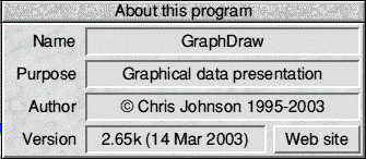
For many years I have used Chris Johnson's excellent GraphDraw application with pupils to plot x-y graphs of experimental results. This program is a prime example of "doing exactly what it says on the tin". All it does is produce graphs - scatter, or with various lines fitted to the data.
Why not use Excel, I hear you say? Or perhaps you aren't saying that, because you wouldn't be reading this if your favourite scientific graphing software was Excel. Now, don't get me wrong - Excel is a powerful spreadsheet; far better than anything we have on RISC OS. I would dearly love to see someone somewhere get hold of the source code for Eureka and allow it to support Excel workbooks. Spreadsheets are perfect for the manipulation of numbers, and Excel can produce superb graphical output of data. However, it is hard, very hard, or even impossible, to get its graphs to meet these simple criteria:
- points must be crosses or pluses, not blobs
- bestfit lines must be thin, not thick
- bestfit lines should intercept an axis, if needed
- axis label units should support superscripts, or subscripts
What makes GraphDraw a preferable package - apart from running fuss-free on any RISC OS 3-5 machine, is that it does do all of the above, and more.
For a number of years now I have sent the odd request to Chris for new features. Now that I have a suite of discarded A7000+ and RiscPCs in my labs, the amount which GraphDraw is used has increased exponentially. So too has the number of features that I have thought would be useful!
Chris recently made GraphDraw 32-bit compatible, so that he - and presumably others - can run it without emulation on the Iyonix PC. In addition to this, a number of key requests made by me have been implemented. Let's have a look at some of these, and why I wanted them:
Display Size, and Print Size
Sometime last year, Chris implemented a display size option. This allowed the graph, as displayed on the screen, to be of various useful sizes. If your screen size allowed it, displaying a graph of 800×600 allowed its projection onto a whiteboard to be useful. I use this regularly!
The only problem was that, if you then printed it, it came out at that size. Chris has recently solved this problem by implementing a default print size, alongside the screen size. Perfect!
Class Sets
In science lessons, it's obviously important that the pupils get plenty of practise at drawing graphs by hand. This is however less important than it used to be, as even coursework can have computer-produced graphs alone. It may well be a thoroughly useful time-killing exercise, but it's hardly a good use of their time if they know how to make a good graph by hand.
Instead, it is great to plot the results from a demonstration in GraphDraw, and give a printout to every pupil. I do this quite often, but normally decide to save ink, time and paper by exporting a drawfile version of the graph into Textease, then creating 4 small versions of it.
The other day, I had just demonstrated the radioactive decay of Thorium (a thoroughly exciting practical involving radioactive gas!) This only took a few minutes, and even less time to enter the results in GraphDraw. However, I needed to correct for background radiation (see gcse.com if you're interested!). GraphDraw couldn't do it!
Now, it should have been able to do it using the constant transformation to a data set. That is, I wanted to add a negative number (i.e. subtract something) to each result. A bug in the software denied the entry of a minus sign! Chris had a fixed version back to me within 6 hours, that could also multiply or divide by values as well.
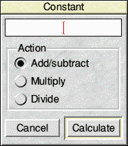
GraphDraw's new data manipulation tool
Having had to correct each of the values manually in the lesson, I went on - as always - to export to Textease before printing smaller versions. Chris had been so helpful and swift in implementing features, that I decided to request a thumbnailing option (similar to that in TechWriter).
I was expecting its implementation to take some time, and perhaps for it to be nearly impossible. Chris pulled it off, and the latest version - which arrived yesterday - has this feature built in!
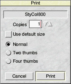
GraphDraw's new thumbnail printing options
This morning, a class of 20 year 10 pupils used the computers - lacking this new facility - to produce current/voltage response curves for red LEDs. Sharing two printers with switchboxes does slow down the whole process. Hopefully with the ability to print two graphs on one sheet of A4, pupils can cope with a nice A5-sized graph that will also stick nicely in their books (without trimming). Perfect!
Line, Curve or Squiggle?
GraphDraw has always had the ability to fit a multitude of curves to data points. Sometimes, though, it is not always possible to choose the right line first time. To change to a different type required you to close down the graph, and decide on something else from the data-entry window. Wouldn't it be nice to be able to choose a different line from the graph menu?

GraphDraw's slicker line-change facility
What you have to remember is that professional users of GraphDraw don't often choose the wrong type of line. In classroom situations, of course, pupils are learning all the time about what constitutes the best line to use. The ability to rapidly try out different options is a bonus. After all, you can do it in Excel!
Interpolation
This is something that proponents of !Draw absolutely love, and GraphDraw can do it too! This time, of course, it involves reading imaginary data points off a trendline (i.e. where data should have been, had you measured it).
This facility is incredible, as it even allows extrapolation beyond the range of experimental data collected. Excel can't do that - instead pupils have to use its equation of best fit line to calculate where points would lie on a line one at a time!
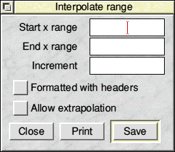
GraphDraw's range interpolation facility
The only trouble with the input window was that hitting ENTER quite correctly and by default hit the SAVE button. Pupils tend to expect it to move to the next input field. Chris has now trapped this with an error window requesting more data. Sneaky GCSE science students can now pad out their experimental results quickly and easily using this facility - if Chris could now add an "introduce random error" feature to its output, that would be perfect!
Axis Range Intervals
This has been in the program for some time now, but was one feature that I requested as I wanted to be able to have a particular separation of the x-axis scale marks, but its sensible default was not quite right.
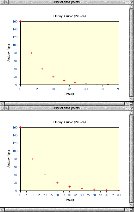
GraphDraw's recently added axis-range intervals in action
Again, it's not actually that important to have the ability to change the axis intervals for professional output - no one would want to read point values from the graph. In teaching, however, it is beneficial to plot a set of graph points, with or without a curve, then get pupils to read values from the lines. Now, with the ability to add more detail to the intervals, we can do this more accurately.
Summary

For me, and for the many pupils who pass through my physics department, GraphDraw is indispensible. Yet, we can cope with Excel. But it is slower, more cumbersome, and lacks many of the features that make GraphDraw in its latest guise unbeatable. I cannot rate it more highly!
Online Links
If you have any questions or comments on the use of RISC OS computers in education, please either email education@harmsy.freeuk.com or better still join the RISC OS Education Discussion List, and air them there.