

What's your type?
The type you make use of within any design document can ultimately reflect on how people perceive your product or service. David Bradforth takes a look at how designers can most effectively select a typeface and use it to best effect within their documents.
Type is everywhere, and not just on the (virtual) pages of the magazine you're reading at this moment in time. Take a moment to look around you and you'll see evidence of type. From the train departure board within a station to the warnings on cigarette packets, the text on a loaf of bread to the idents used on television each has a message to convey. It's all about communication through visual markings, using the right text to accompany images; and ultimately to become a great designer takes an understanding of the messages type conveys and how you can manipulate those messages to work for you.
Typography is such a vital part of graphic design, but it gets very little respect. While the computer has made fonts accessible to the many, there are literally thousands (if not millions) of badly designed corporate business brochures, websites and so on that illustrate the need for training.


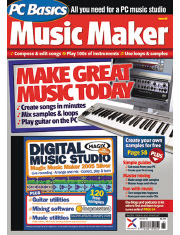
Having an understanding of your audience is vital when it comes to selecting typography. Hotdog and PC Basics magazines addressed two distinctly different audiences and the type used reflects this.
Selecting the right words for your message is vital; but the way you present it is equally so. Consider a magazine such as Hotdog; if the magazine were presented in a fashion similar to say PC Basics; but with the same content it would not have half the success it does. The reason is simple – you need to understand your audience. PC Basics has an older readership than Hotdog, and it’s an entirely different market.
So how do you go about selecting type successfully?
Using type in context
Typography is basically about communicating a message through the use of a legible pattern of shapes. Back in the early days, it was by carving a message into rock, then progressing over time to the digital layout systems of today. Whether you were using a rock or Ovation Pro, the principle is much the same; to visually stimulate the reader so they have a better understanding of the message you’re trying to convey.
With the introduction of the graphic designer as an artist, type was taken into new territories; forming a part of the design in such a way that occasionally it was impossible to read the text used. Hence one important consideration in typography is this, do you want people to notice the design, or to notice the words but without an understanding of the work that’s gone into it.
Consider the branding for McDonalds, with the ‘M’ logo forming the well-known golden arches. While the menu may change in restaurants around the world the branding is consistent; so whether you’re in the USA, France, Spain or the UK you can always tell a McDonalds from a distance because of the bold yellow branding. Psychologically, the bright colour is attractive to kids with the arched logo indicating fun within.
Where health and wellbeing are the primary aims of a company, the corporate logos take a classic approach in their formation. Using a combination of simple type (Marks & Spencer use the font Optima to good effect within their stores; while their online presence uses a light variant of Helvetica to signify that the company has everything for you) and stylish presentation the impact of type in this sense cannot be understated.
Fonts and feeling
With a quick walk down the high street you’ll quickly notice that the same fonts are used everywhere. Variants of Comic Sans are frequently used where fun is the primary emotion (along with various ‘illustrative’ types that incorporate fun elements into the fonts themselves). If your message is important, a bold type such as Helvetica or Impact is often better. The strength of fonts is key, crucial to the delivery of the message – so using the most appropriate font weights is also important.
When developing your own artwork, it’s worth remembering that despite the variations in styles and fashions the fundamentals of typography have remained the same. While Serif fonts (such as Times and Garamond) can add respectability to a brand, over-using Italics can cheapen the perception of a product.
The use of colour will change the perception of what a product might be. Using bright colours for a business product may lessen its appeal to your target audience. Imagine purchasing photocopy paper with bright red and yellow packaging – it’s an added expense in production and ultimately the customer will go for the product that does the job best for them.
One of the great things about fonts in logos is that you can alter the text of a logo without changing the impression of the font. With McDonalds being a prime example, where various activist websites have produced logos based upon the McDonald’s golden arch design and font, the signage remains familiar regardless of the fact the aim is different.
Changing the meaning of words
What’s important about typography is this. No matter which typeface you set your work in, it will still be the same work. Regardless of whether it’s a 2000 word article, or two words, typography serves as a way to improve the impact of a good quality message.
If you’re developing a branding for a new product line, but there is some flaw in the text side of the branding (or other graphical elements of it) choosing a stylish typeface will not help to correct what is already a fundamental error.
The essence of choosing fonts is to convey tone, style and attitude. Clear, crisp and concise lettering will always have visual appeal, whereas typefaces with more of a flourish to them have their place in headings/promotional items as well.
The right face for the right job
Ultimately when it comes to selecting a typeface to use within a creative piece, whether it’s web or print-based, you’ve got a number of primary considerations to make.
Through the use of Cascading Style Sheets you can use literally any font within a web page. However there’s very little point in selecting a font that only a small percentage of your audience will have access to; hence limiting the overall impact of your site. Sticking to the standard fonts supplied with Windows (Times, Arial and Courier) will ensure that your site maintains the best visual impact and experience across all users’ computers.
On the other hand, using the latest version of Flash there’s nothing to stop you building a Flash project that makes use of each font; although this will ultimately slow down users experiences of your websites and have you running into issues if you need to update quality within the future and don’t have easy access to the fonts used.
In the print sense, selecting the right face comes down to a number of factors. You need to understand the message you’re trying to send to those picking up your item, regardless of what it is. If you’re trying to sell low-fat food to the audience of today, do you have a way of passing on the message that it’s low-fat without including the word ‘fat’ as a part of the branding? Sainsbury’s Be Good to Yourself range is a prime example of a successful implementation of this theory.
Next you need to understand your target audience. If you’re going for a younger audience, the style of typography used will reflect this perhaps using type with somewhat more of a flourish; an older audience appreciates type that’s clear and easy to read, presented appropriately. Using graphical backdrops for a younger audience is acceptable, but if the majority of your audience is a little older than that making the text easy to read should be your priority.
When it comes to physical typography, an understanding of the golden rules of typography will help to ensure that your message is best achieved. They’re certainly there to be broken, but provide useful guidance as to how you can get the most out of type on the printed page. These are:
- Don’t mix too many different fonts on a printed page; use at most two on a page and keep them very different. This will ensure that the reader makes more focus on your content rather than the way in which it’s presented.
- Keep capitals to a minimum; perhaps using them purely for headings on the printed page. Using capitals within body text MAKES IT LOOK LIKE YOU’RE SHOUTING.
- If you ensure that your text is divided into columns of between 40 and 50 characters, the eye can scan it quickly making it easier to read.
- Orphans (short lines at the top of a column) and Widows (a single world on a line) just look wrong.
- Don’t centre text for headers within body text. It makes the page less easy to scan.
- What’s the point of the typography? Is it the words, or their style? Either way it’s fine, just so long as you state it at the start.
Finally take a look at other existing examples around you to get an idea of what’s been achieved before. Plagiarism is nobody’s friend, but taking inspiration from the creative elements around us is a basic element of design. Then, once you go shopping for the right typeface (through www.eff.co.uk or similar) you’ll have a clear idea of what you’re looking for and hence be in a position to better understand which faces are available for your needs.
David Bradforth