Back to Contents Previous Next
Start-up & Overview
Double-clicking on the application icon will run the application and install an iconbar icon in the usual way.
If you do not have a printer driver loaded a warning will appear to encourage you to do so. You do not need to quit the application to load a printer driver.
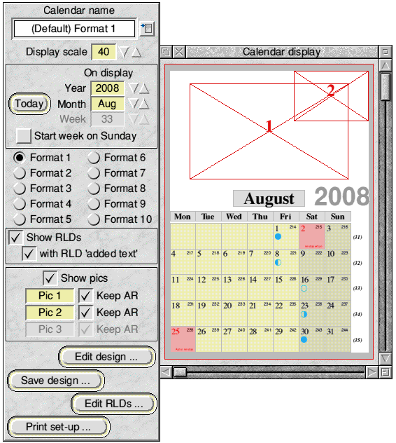
Clicking with <select> on the iconbar icon will open the main display window with (as supplied) the default calendar design for Format 1 showing - probably at 40% scale. If the configured paper size of the printer driver is smaller than the overall calendar size the calendar may not display in its correct position and a warning will appear telling you this, so that the printer driver can be changed (no need to quit the application to do this).
A Toolpane window also appears, attached to the left hand side. The screen-shot below shows this.

The recommended first step for anyone new to !Calibre is to look at each of the available calendar formats by selecting, in turn, each of the Format radio icons in the centre of the Toolpane. At each format choice the corresponding supplied default calendar design file will be loaded and displayed.
When doing this, it will also be seen that the initial display is for the current year and month (and the current week, but this will be greyed out in all but Format 6).
Further, although a design might show one or more defined picture areas (indicated by a rectangle with diagonals and a number) there will be no pictures displayed initially.
For any displayed calendar format, using the year/month/week nudger icons in the Toolpane will change the displayed year and/or month and/or week as desired - and as appropriate to the format. The earliest year available is 1999 and the highest year is 2050.
The scale of the display is easily changed via nudger icons or from a menu of preset values. The scale initially shown for any calendar is part of the saved design. (Please note that the displayed scale and has nothing to do with the size of the printed output - see later.)
It is important to note that each of the supplied default calendar designs is merely a particular example of the format, and the user has wide flexibility to customise designs and save them. In particular, the supplied calendar designs are deliberately restricted to using the common RISCOS fonts to ensure all users can view them as designed. Your own designs can expand beyond these.
Once saved, calendar design files can be easily re-loaded at any time from a menu - or, if required, by dragging in.
Start week on Sunday
Normally, !Calibre uses Monday as the first day of the week. But in some Formats there is an option button in the main toolpane allowing the user to change the first day of the week from Monday to Sunday. (This option is not available in Formats 5, 6. 7 and 9.)
Customisation
The customisation of the calendar design is mainly carried out via a number of subsidiary windows accessed by clicking the Edit design ... button in the Toolpane.
Red Letter Days
!Calibre gives the user full control over Red Letter Days (RLDs) i.e. individual dates that the user wishes to be highlighted in some way. Commonly, the user will wish to use RLDs for marking Public Holidays (and !Calibre can add the English ones automatically, if required) but as up to 150 RLDs can be applied to any one year there is scope for many other uses e.g. religious days, birthdays, anniversaries etc. (As supplied, the maximum number of RLDs per year is 64 but this can be changed via the iconbar menu.)
RLDs are divided between ‘permanent’ RLDs (which will appear in all years) and ‘one year only’ RLDs (which will appear only in one designated year). The user will normally use a mixture of the two types.
Lists of RLDs can be compiled via the Edit RLDs ... button in the main Toolpane - and once an RLD list has been saved as a file in the recommended way it becomes immediately effective with any format. The user can, of course, switch the display/printing of RLDs on/off at will - and also switch on/off any RLD ‘added text’, if required.
Multiple RLDs can be defined for the same date and options are provided for how these are to be shown.
Printing
When the user wishes to print a calendar design, access to the printing set-up window is via the Print set-up ... button in the main Toolpane.
Apart from the fact that you can only print the design which is currently loaded, printing is an independent process and the user can choose to print a range of calendar pages and copies. For example, using a month-per-page format, the user may wish to print the twelve months of a year - perhaps with a different main picture for each month but the same second picture on each month. Considerable flexibility is provided here.
A further printing option is to print 2 or 4 calendar ‘pages’ per sheet of paper, for which scaling is applied automatically. This offers interesting options for printing small calendars e.g. the popular ‘calendar in a CD case’.
Additionally, calendars can be inverted and, for 2 or 4 calendar ‘pages’ per sheet of paper, their positions on the sheet can be altered.
Also, individual sheets and alternate sheets of the chosen print run can be printed.
Whichever printing options are chosen, a printing preview option is available. This is helpful for stepping through a print run to check that all is in order before committing to paper.
The ‘stacking order’ of items
The order in which the various elements on the calendar are displayed/printed determines their ‘stacking’ order if the user chooses to introduce overlapping elements in the design. The different formats exhibit slightly different stacking orders.
The calendar outline is always rendered last, so will always be ‘on top of’ everything. On the display it will then be obvious when any other element is outside the calendar area. When printing, the user has the choice of switching the calendar outline on/off and it is assumed that the only reason for choosing to print it will be to show post-printing cutting lines - for which its full visibility ‘on top’ would seem sensible.
The order of other elements depends on the format being used. In Formats 6 & 9 the order has been chosen deliberately to ensure the single column of days/dates is ‘above’ the blank area. This gives extra design flexibility.
In other formats, the relationship between the day & date areas is less important to the design options.
In all cases, the background (boxfill) colour is always rendered before any text, and the outline/grid after the text.
Ignoring the graphics areas for the moment, the Year and Month elements (in that order) are rendered after the above items and will therefore always appear ‘on top’ of the date/day/weeks if overlapping occurs. Again, their respective boxfill colours will be rendered before the text - and the box outline after the text.
The pictures, by user choice, can either be rendered before the date/day/week elements or just before the calendar outline. So they can be either ‘right at the bottom’ or ‘right at the top’ of all other elements - except for the calendar outline. This choice can be made individually for each picture and their respective frames will follow the user-choices if a picture area is activated but no picture is actually displayed/printed.
The combination of the stacking order and the transparent boxfill options (see later) provides many opportunities for creative designs.
Top of page Back to Contents Previous Next

