Back to Contents Previous Next
A suggested general procedure for calendar design
A good general sequence, leaving out many of the details, is:
1) Decide the format required and display its default design. Note that the display indicates the printing margins of the currently loaded printer driver/paper combination.
(The following assumes that the chosen format is in the range 1-5: there are some differences with other formats.)
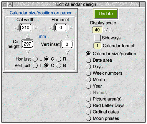
2) Click on Edit design ... in the Toolpane, which opens the ‘Edit calendar design’ window as in the screen-shot below

The right-hand side of this window has a number of radio icons corresponding with the different design elements of the calendar. Clicking, in turn, on each radio icon changes the sub-pane on the left to show the current values relevant to the chosen element in the displayed design, and the controls to alter them e.g. size, position, text font text position etc, as appropriate.
All measurements are in millimetres, except for font sizes which are in points.
3) If it is not already selected, choose the top radio icon i.e. Calendar size/position, to show the pane containing the overall calendar size and position measurements of the currently displayed calendar on the currently configured printer paper - exactly as in the above screen-shot.
4) Decide the finished calendar size for your new calendar - and change the width/height values as necessary (using the nudger icons and/or normal writable icon editing).
As you do this, note that nothing changes on the display - but the Save design ... button has been disabled (as has also the Start printing button in the print set-up window and the Print sheet and Print all buttons in the printing preview window - see later).
Click on the Update button to incorporate the changes into the screen display i.e. the new overall calendar outline is shown - which may, in turn, have affected the position of some of the other elements. (Note that the display window title bar now contains an ‘unsaved data’ asterisk - and the Save design ..., Start printing, Print sheet and Print all buttons are again enabled.)
5) Decide how this new calendar outline is to be placed on the paper and alter the hor/vert ‘justification’ radio icons and/or the hor/vert offsets accordingly.
For horizontal justification the choices are Left (L), Centre (C) or Right (R). For vertical justification the choices are Top (T), Centre (C) or Bottom (B). The offset for that direction is ignored if Centre is chosen - otherwise they are (in this sub-frame) the offsets from the appropriate edges of the paper e.g. ‘hor offset’ is from right edge of paper if ‘R’ justification is chosen.
Change the values as required and click on Update to effect them.
6) On the right of the ‘Edit calendar design’ window, select the Date area radio icon and decide how large the main date area is to be and where it is to be placed on the calendar. This time the offsets are relative to the edges of the chosen calendar area. Change the values and click on Update to effect them.
The user has full freedom over the date area size and position, and the resulting grid of identical date boxes (e.g. 35 of them in Format 1) will fill the chosen date area size automatically. Thus you could choose to have the date area occupying most of the calendar page (giving date boxes large enough to write short messages in) or to have the area small (to produce a desk calendar, perhaps).
In Formats 6 & 9 the main ‘Date area’ becomes the ‘Blank boxes’ area and the date text appears in the single Day/Date column instead.
7) Scroll the sub-pane to reveal the controls to choose the date text size, font and position noting that the text offsets are now relative to the sides of the individual date boxes. Again, click Update to see the changes.
8) Visit, in turn, the editing sub-panes for the Days, Month and Year etc. and alter them as required. Note that, depending on the actual format chosen, there are small differences to how sizes and positions are handled.
For example, in Formats 1 & 2 the days are in a single row of boxes above the date grid. The height of this row and its vertical separation from the date grid can be altered, but the width of the days boxes is, of course, fixed at the same width as the date boxes. Conversely, in Formats 3 & 4 the days are in a single column to the left of the date area - and this time it is the width of the days area that can be altered freely.
Note that the text form of the months and days can be chosen to be Full, Shorter or Shortest i.e. January/Jan/J and Monday/Mon/M. (The user can decide exactly which text is used in each case - see later.)
9) Decide whether pictures are to be added (up to 3 per page) and size and position the areas accordingly. They will appear on the display as rectangles with diagonals plus a number. To display an actual picture drag a drawfile or JPEG to the required picture area or to the corresponding Pale Yellow icon near the top of the main Toolpane, labelled Pic 1, Pic 2 and Pic 3.
Pictures will be scaled to fit the picture area and you can choose to maintain their original aspect ratio or not - via the Keep AR option button.
Don’t forget that any picture area can contain text in a drawfile in addition to, or instead of, graphics. e.g. picture captions can easily be used in this way.
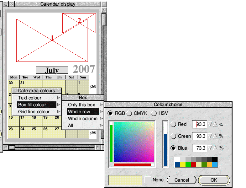
10) Choosing the colours of the various elements is normally handled directly by clicking any button over the appropriate part of the displayed calendar. Thus, to choose colours for the date area (i.e. boxfill, date text and outline colours) a button is clicked while the pointer is within the date area - with a sub-menu tree covering all the separate elements. Depending on the actual format, the date and days boxes and the date/day text can be coloured individually or as whole rows/columns etc. The button click needs to be made within the required box/row/column in these cases. The best policy here is to ‘suck it and see’.
The following screen-shot shows the colour menu tree available after clicking over one of the date area boxes in Format 1.

Once a colour has been chosen and the OK button pressed in the Colour Picker window, the colour change takes place immediately without the need to use the Update button - and, again, an asterisk will appear in the display window title, if not already there.
11) If appropriate to the chosen format, decide whether the weeks are to start on a Monday or a Sunday and, if the latter, click to tick the Start week on Sunday option icon. Any date/day box and/or text colours you have chosen will be shifted to retain their correct relative places. (Note that if this option icon is ticked and the format allows Week numbers, the Show Week numbers option icon at the top of the Week numbers editing sub-pane will be unticked automatically and the option disabled - see later also.)
12) Saving the changed design is straightforward, but is left until later.
The above sequence is intended as an initial rough introduction to the design process. As can already be seen, most of the editing sub-panes are very similar to each other and once the general actions have been tried they are more or less the same for all.
It will be noticed that some options (e.g. Week numbers, Names) are not available with all formats, and some parts within the sub-panes are disabled in some formats. Similarly, the text of some of the labels in the sub-panes changes and also the text against the radio icons.
Red Letter Days, Ordinal dates and Moon phases are best described separately and they are covered later.
Top of page Back to Contents Previous Next

