Back to Contents Previous Next
Editing sizes, positions, fonts etc.
Customising calendar designs to the way you want them to look is mainly a combination of using the tools accessible from the ‘Edit calendar design’ window, plus selecting the colours in the main display (as already described) - and choosing your RLDs.
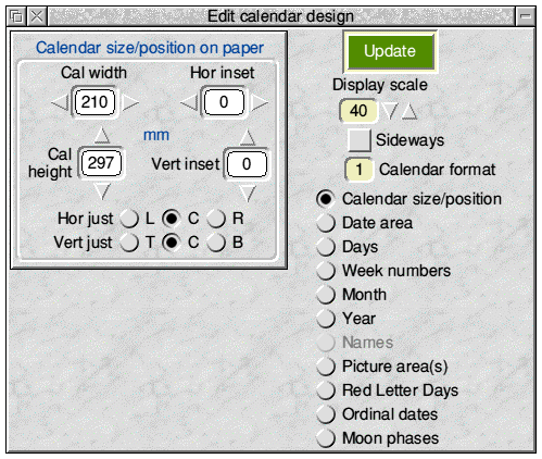
The ‘Edit calendar design’ window (briefly introduced earlier) is opened by clicking the Edit design ... button. Initially the window will look like this.

The Update button has already been introduced, but it needs to be added that many (but not all) of those various design-altering actions in the calendar design sub-panes which have instant effect (e.g. the Day text form radio icons - see later) also include the effect of the Update button i.e. any un-incorporated changes will be captured at the same time.
The Display scale group of icons is a repeat of those in the main Toolpane. Either can be used and both stay in sympathy.
The Sideways option icon puts the design into landscape mode. The ‘paper’ is turned sideways and the printing margins altered accordingly. A sideways calendar is designed in exactly the same way and will be printed in landscape mode (if 1page-per-sheet is chosen).
The Calendar format icon merely reflects, for convenience, the format of the currently displayed calendar.
Below this, the column of radio icons on the right determine which element of the calendar design is to be addressed and, accordingly, which editing sub-pane is displayed on the left. Some of the sub-panes need to be scrolled or expanded to get to reveal their full extent.
With few exceptions, all the sub-panes involve similar user actions and they will be taken in turn below.
All measurements are in millimetres (or points, for font sizes).
It is also worth noting that offset values can be negative as well as positive which gives greater flexibility. For example, pictures could deliberately print outside the calendar edge to be trimmed - or the row of days boxes in Format 1 could be placed below the date area. This feature is very useful in Formats 6 & 9 where the single date/day column can be placed over the blank area to achieve specific design aims.
Calendar size/position
The sub-pane - on display in the above screen-shot - has been introduced already.
Date area
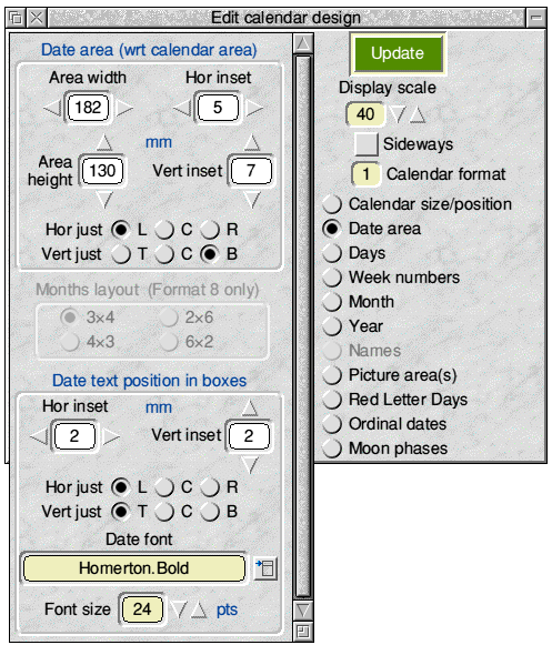
This sub-pane is shown below (in its expanded form).

Apart from the greyed-out area in the centre, this is a fairly typical design sub-pane. The Dark Blue labelling above a framed area describes the elements being addressed in that frame. So, here, the top area alters the date area by setting its overall width/height and offsets with respect to the calendar area.
The offsets are ignored if ‘Centre’ (C) justification is chosen. Otherwise the offsets refer to the distance from the appropriate edge of the calendar area e.g. distance from the right edge if ‘Right’ (R) is chosen. For vertical justification the choices are ‘Top’ (T), ‘Centre’ (C) or ‘Bottom’ (B).
The bottom area controls the date text font/size and position within each date ‘box’ and the offsets and justification settings are interpreted as before - except that they are now relative to the individual ‘box’ sides.
All of the above changes need the Update button to bring changes into effect.
The central greyed-out area only becomes enabled when Format 8 is chosen i.e. a 1-page-per-year calendar showing all 12 months as mini-months in 7×6 date blocks. The four radio icons then determine the layout pattern of the mini-month blocks within the overall user-chosen date area. Thus, 3×4 means the 12 months are arranged in equally-sized blocks, 3 across and 4 down. Clicking these radio icons has an immediate effect on the display.
When in Format 8 it will also be seen that those items concerned with changing the date text position within boxes are disabled, because they are not user-changeable in this format - and there are various other disabling/enabling instances throughout the calendar design editing sub-panes depending on the format being worked on.
It is worth noting at this point that the ‘Date area’ label on the radio icon producing this sub-pane is changed for some formats and the sub-pane’s role changes a little correspondingly. Thus, in Format 5 the radio icon is labelled “Days/Dates” and the sub-pane then controls the area and position of the main grid of boxes which carries both the Date and day text. The Date text is still controlled here, and the Day text is controlled in the ‘Days’ sub-pane.
Then, in Formats 6 and 9, the radio icon has the text “Dates/Blank boxes” and the main date area controls are now used (and labelled) to size and place the grid of blank boxes which is the key feature of Formats 6 and 9. But the Date text (which in these formats appears in the same boxes as the Days text) is still controlled from the bottom framed area of this current sub-frame.
Days
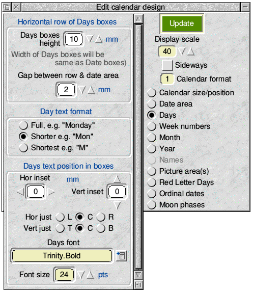
This sub-pane is shown below.

The icons in this sub-pane are the subject of much disabling/enabling action as the calendar format is changed: some of its text labels are also changed.
In several formats the days of the week are shown in a single row or column of boxes adjacent to the date area. This row/column always has its width/height (respectively) necessarily set to the width/height of its associated date area, but its other dimension is user-changeable - as is the vertical/horizontal separation of the row/column from the date area. Thus, the top framed area of this sub-pane controls the free dimension of the row/column and its separation.
The bottom framed area concerns the font/size of the days text and how it is placed in the days boxes - exactly similar to the date text controls described earlier.
The middle framed section has three radio icons (with immediate effect) for choosing the form in which the days text will appear e.g. either as “Monday” or “Mon” or “M” (if the supplied English is used).
In Format 10, where the days appear in single row, there may be no choice but to use one of the shortened forms of day text because the width of the days boxes is set by the date area size. A similar, but less stringent, factor may occur with the single column of days in Format 7.
Week numbers
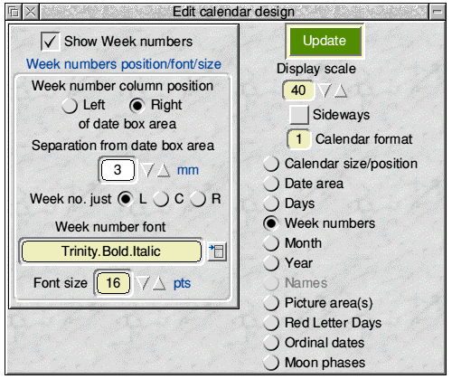
This sub-pane looks like the screen-shot below - and it is not accessible in those formats which do not have the option of showing week numbers.
Please note that the designation of Week numbers is internationally recognised and based on weeks starting on a Monday. Thus, in !Calibre, choosing to start weeks on a Sunday means that using Week numbers then becomes inconsistent - see below for consequences.

The option button at the top simply switches on/off the display/printing of Week numbers.
The framed area has the, by now, familiar controls over how the Week numbers will appear and where they will be placed. For obvious reasons, Week numbers need to be visually associated with their corresponding dates and in Formats 1-4 this means that the Week numbers will be in a column or row adjacent to the date area and the text of this sub-pane will change to reflect the user-choice available - which is the separation distance of the Week numbers from the date area and at which end of the row/column of dates it should appear. The font/size is also a user-choice.
The week text justification is only available in Formats 1, 2 and 8 (where the Week numbers are in vertical columns). The horizontal justification is then with respect to the chosen separation distance, and normally it looks better to use Right justification when the Week numbers are on the left - and vice versa.
The Week number always appears in brackets.
As has already been mentioned, when the Start week on Sunday option is ticked, the Show Week numbers option icon in the Week numbers editing sub-pane will be automatically set to unticked and disabled - and, if present, Week numbers will therefore disappear from the display/printing.
Month
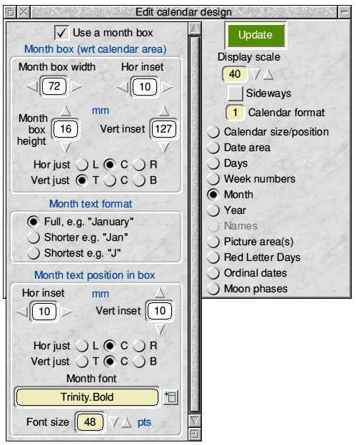
The editing sub-pane for the Month changes according to the Format being edited, but is otherwise straightforward. For Formats 1, 2, 3, 4, 5, 6, 8 & 9 the following sub-pane will appear.

Its only feature needing explanation is the Use a month box option icon at the top.
This is provided because it is possible that some users may wish to use a pictorial representation containing the month name(s) i.e. using one of the three available picture areas for the months. In this case the month box can be suppressed altogether.
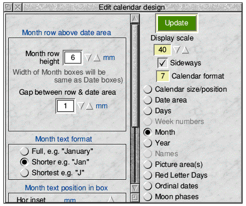
In Formats 7 & 10 the top of the sub-pane is replaced as below, because the 12 months are used in a single row or column - the labels change as necessary.

In both cases, there is a practical point to watch concerning the size of the month box(es). When using the full month text form check that your month box size is large enough to take the longest month e.g. “September” in English. (In Format 7 the only option may be to use the shortened month names because the width of the month boxes is set by the date area size. Similar, but less stringent, restrictions may apply for the single month column in Foramt 10.)
Further, if using Format 6 there will be frequent occasions when a week spans a change of month (and sometimes a year also). For these weeks only - whatever text form is chosen for the month normally - the month text will be changed to the ‘Shorter’ form with both months included e.g. “Aug/Sep”. The month box needs to be large enough to cope with this.
Year
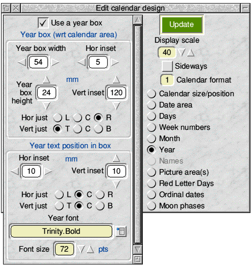
This sub-pane is straightforward and appears as below.

Again, an option icon is provided in case the user wishes to use a pictorial representation of the year.
When using Format 6, as has already been noted above for the month box, the last week of a year may well need to show both years involved. The form then used is “2007/08” and the year box size should be made large enough to accommodate this change.
Names
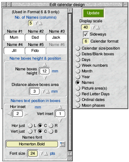
This sub-pane is only available when Format 6 or 9 is used.

In Formats 6 and 9 - the 1-page-per-week and 1-page per-month ‘family’ calendars - there is a grid of blank boxes and, from a design viewpoint, this blank box area substitutes for the date area in other formats, as already mentioned in the description of the ‘Date area’ sub-pane. This is reflected in the text change shown above for the second radio icon, which now reads “Dates/Blank boxes” instead of its more usual “Date area” (or “Dates/Days” in Format 5).
The first control in this current sub-pane therefore allows the user to choose how many blank area columns there will be e.g. how many family members will be using the calendar. Changing the number of columns (there is a maximum of 6) gives an immediate response on the display and the blank area grid adjusts automatically to fill the user-chosen blank area size with the chosen number of columns - each of the same width. There are, of course, always 7 rows in Format 6 and 28-31 rows in Format 9 (depending on the month). A single row of names boxes to head each column is similarly recalculated.
Beneath this are writable icons to allow user-choice of the Names appearing in the names boxes at the top of each column. If there are less than 6 names columns then writable icons will be disabled correspondingly. The Update button is used to activate name changes.
Below that are two familiar framed areas which control the names boxes height and separation from the blank boxes area, plus the font/size and justification of the names text within their boxes.
Picture area(s)
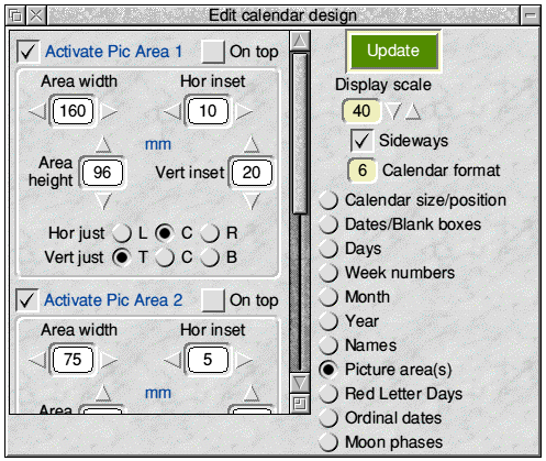
This sub-pane has three identical framed areas, one for each of the possible picture areas. The top framed area - for Picture Area 1 - is shown here.

The framed area is, by now, self-explanatory: the justifications are relative to the edges of the calendar.
The top two option buttons determine whether this particular picture area is to be used and whether it is to be rendered ‘underneath’ or ‘on top’. ‘Underneath’ means everything else will be on top of it. ‘On top’ means that only the Calendar outline (if shown/printed) will be ‘above’ it.
These choices can be made independently for each of the three possible picture areas.
Where two or more pictures are chosen to be at the same ‘level’ the lowest picture area number is rendered first - so that the highest picture number will be ‘above’ the other picture(s).
Red Letter Days appearance
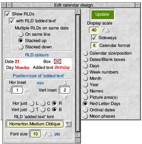
This sub-pane determines how any RLDs will look in the particular calendar design. It has a unique feature because it provides for the selection of the RLD colours, which cannot be handled in the usual way. The sub-pane looks like the following screen-shot.

The top of the sub-pane repeats the Show RLDs and with RLD ‘added text’ option icons from the Toolpane and already described there.
The panel below that allows the user to choose how any RLD ‘added text’ will be shown if any date has more than one RLD defined for it. (The RLD added text is part of the RLD list saved independently from the calendar design - see ‘Red Letter Days (RLDs)’ later.)
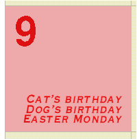
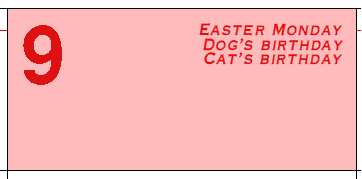
In these cases the order in which the separate RLD text items appear is determined by their order in the RLD list files, but there is also a choice of layout. To help demonstrate this the screenshots below all use the same order of the items: “Easter Monday”, “Dog’s Birthday”, “Cat’s Birthday” but with different layout choices.
On same line. In this case the multiple ‘added text’ items are concatenated with a back-slash (“\\”) separator.

Stacked up

Stacked down

The limit to the number of multiple items is set only by the restriction that the total length of the string (as in the ‘On same line’ screenshot above) must not exceed 255 characters - which includes the back-slash separator(s). This restriction applies to whichever layout choice is made. (There is probably a more potent restriction in practice because the RLD ‘added text’ really needs to fit within the date box ........)
Note that RLD dates and days are always in the same fonts/sizes as the normal dates and days: it is only their colours which can be made different.
Thus, the text controls in the bottom framed area concern only any RLD ‘added text’, which can be in a separate font/size and colour.
In the small white-background rectangle near the middle of the sub-pane there is shown a sample Date (“21”), sample Day (“Monday”) and sample added text (“Birthday”) and each are in their current fonts and RLD colours but, because of the limited space, their sizes in this sub-pane are all at a standard 12 point rather than their true sizes - which latter will be shown on the main calendar display.
The white-background rectangle acts as the focus for choosing the RLD colours. Pressing <menu> anywhere in this rectangle leads to a, by now, familiar-looking menu tree for choosing the colour of the RLD date text, day text, any added text and date/day boxfill. The action is then entirely similar to !Calibre’s main colour selections.
To avoid any confusion, if the RLD box-fill colour is chosen as White the top right corner of the focus rectangle changes colour to provide the necessary contrast. It will also be noticed that the option to make the RLD box transparent is not provided.
Finally, there may well be a wish to have an RLD design which alters the colours of the text items but leaves the box-fill colour as whatever is normal. This option is provided for in the first sub-menu leading from the ‘Boxfill’ menu item. Selecting the first sub-menu item ‘Use normal colour’ puts a tick against this item and any RLD box will then continue to have its normal fill colour. If this option is chosen the small coloured rectangle in the top right part of the White box will appear with an outline plus diagonals. Using the Colour Picker window leading from the second sub-menu item will, of course, untick the first item again as soon as a specific RLD box-fill colour is chosen.
Ordinal dates
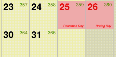
Ordinal dates are simply the number of days since the beginning of the year. They thus run from 1-365 (366 in leap years) through the year.
This sub-pane is not available in Format 8.

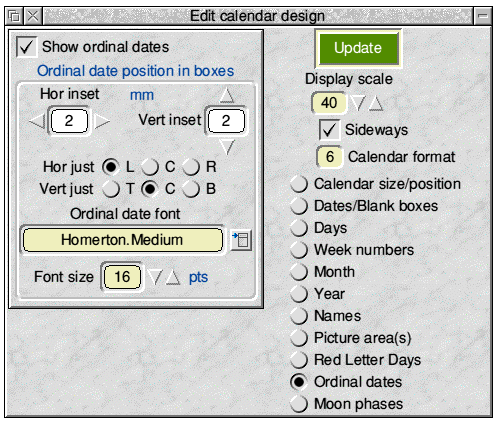
This sub-pane is handled in exactly the same way as similar sub-panes. The only point to note is that the ordinal date is in addition to the normal date and so care needs to be taken in its positioning in order to avoid overlaps. Don’t forget to check with the longest ordinal date on display i.e. December.
An example screen-shot with ordinal dates showing is given below.

Moon phases
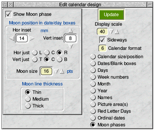
This sub-pane, which is not available in Format 8, allows the four moon ‘quarters’ - as shown below - to be displayed/printed on appropriate dates:

 The moon symbols are provided by the font CalMoon which is contained in the Defaults folder and loaded automatically on start-up. (You can, if you prefer, add this font to your permanent pool instead. See Tips, later.) Thus, the size of the symbols as well as their position can be chosen by the user in the usual way in the above sub-pane.
The only refinement is that there is also a choice of line thickness i.e. the thickness of the circular perimeter when it appears against an un-filled part of the symbol.
As mentioned briefly before, the colour of the moon symbol can be changed in the usual way from the menu which appears if <menu> is clicked on the main display window outside one of the defined calendar areas.
It should be noted that the dates on which the moon phases appear are contained in the file MoonQuarters inside the Defaults folder. (This must not be deleted.) They are appropriate to GMT (UTC) and cover the range of years corresponding to !Calibre’s year limits 1999-2050. They are believed to be correct and have not been derived by using an average moon cycle.
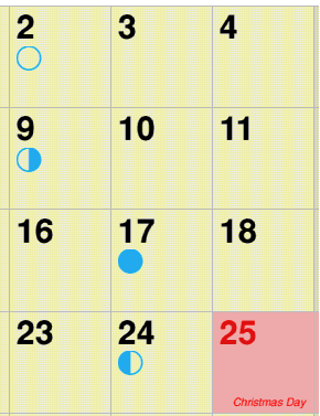
An example screen-shot with moon-phases showing is below.

General design editing points
As the display is usually being used at less than 100% scale the displayed fonts are themselves scaled in the display and it might be prudent to check at least part of the display at 100% prior to printing. This applies particularly to Formats 7 & 8.
Also please remember that if your calendar designs are to be sent to other people as files they may not have all the fonts you have used. !Calibre’s font checking facility will pick this up on loading but the recipient might need to change your design.
Top of page Back to Contents Previous Next
